18+
Research interviews
159K
Average weekly events
238K
Peak weekly events
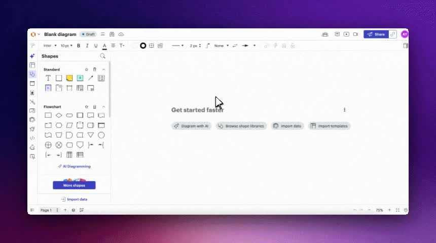
The project in a nutshell
Over the years, product managers and designers at Lucid had noticed a recurring pattern. Users were manually creating legends for their diagrams using basic shapes, text fields and icons.
Our research later showed that 73% of users had created some form of legend. We were not trying to introduce a new behavior. We saw an opportunity to take something users were already doing, make it easier, remove some of the pain and create a more delightful experience.
The workaround worked, but creating a legend this way was slow, fragile and difficult to reuse.
“I want to be able to send a diagram to someone and not need to provide additional context. The diagram key does that.”
The project started with a simple question: could we turn this existing behavior into a native Lucidchart feature?

My role
I led the interaction design for the feature and co-led research with my Product Manager over nine months.
Responsibilities
- →Understanding how and why people created legends
- →Planning and conducting research with my PM
- →Designing a new type of canvas object
- →Prototyping colors, shapes and automatic generation
- →Working through canvas limitations with engineering
- →Testing concepts and coded prototypes
- →Prioritizing the first version and later roadmap
- →Exploring integrations across Lucidchart
- →Reviewing usage and behavior after launch
Research
Understanding how people used legends
Leadership saw legends as a promising area and asked my PM and me to investigate the opportunity.
We conducted 30-minute, semi-structured interviews with Lucidchart users. We recruited through email and focused on people who had been active within the previous month.
We started with broader questions about their work:
- →What was their role?
- →How did Lucidchart fit into their work?
- →What kinds of diagrams did they create?
- →Who was the audience?
- →What made those diagrams difficult to communicate?
We then moved into questions specifically about legends:
- →When was the last time they created one?
- →Why did the diagram need it?
- →How did they build it and what did they include?
- →Did the people consuming the diagram find it useful?
- →Could they show us an example they had created?
Testing the first prototype without leading users
Only after learning about their existing process did we show participants a simple Figma prototype. It simulated a color-based legend and supported:
- →Adding an item
- →Deleting an item
- →Reordering items
- →Editing labels
Waiting protected the research from our solution. We wanted people to describe their real behavior before our prototype gave them a new vocabulary for it.
We started with color because it was the most straightforward version to build. We also asked what else belonged in a legend: shapes, line styles, object sizes or Conditional Formatting rules.
Key, or legend?
One thing we kept circling back to was what to even call it. In almost every interview we asked what “key” meant to them, and then what “legend” meant, and people did not really agree. Some used the two words interchangeably, some had a firm idea of one and not the other.
That is partly why the feature shipped as Diagram Keys while I still say “legend” through most of this write-up. We never fully settled the naming, and I would rather leave that as an honest loose end than pretend we resolved it.
What we learned
People were already doing the work manually
Users were assembling legends from basic shapes and text. It worked, but it was slow, tedious and hard to reuse. The need already existed; we needed to make a familiar workflow easier rather than persuade people to adopt a new one.
When we put early mocks in front of people, the reaction was blunt. One business process analyst said employees “don’t know the notations,” so a key “would help a lot.” We were not selling them on a need. They already had it, and were doing it by hand.

A legend is primarily a consumption tool
People used legends to help someone else understand a diagram. The reader might not know why certain colors, shapes or lines were being used. The legend’s primary purpose was comprehension.
A few people pushed this further and asked for view-only collaborators to see what was powering a shape, not just the shape itself. That stuck with me. The person reading the diagram is usually not the person who built it, and they are who the legend is really for.
A legend is not a second creation tool
I explored selecting a color in the legend to highlight corresponding objects on the canvas. Exact matching was unreliable—two colors could look identical while using different hex values—and users did not see the legend as another place to configure their diagram.
They wanted it to explain the canvas, not become a second interface for controlling it.
What is interesting is that people kept reaching for that second interface anyway. In testing, several users clicked a key item and tried to make it select or recolor the matching shapes, or right-clicked expecting a “link these” option. The instinct was real, which is why we kept exploring it. The same sessions showed why it was risky though. “To the user, nothing is obvious,” and the color matching could quietly break. With Conditional Formatting the question got sharper. Was the legend there to help someone understand the changes on a diagram, or to power those changes? We decided it was the first, and that kept the scope honest for the rest of the project.
Users wanted the experience on the canvas
My original proposal kept the legend and its interactions directly on the canvas. Engineering suggested moving configuration into the right panel because it would be easier to build. Research validated the canvas-first direction: users expected to edit the legend where it lived and wanted it to behave like a native shape.
It was not unanimous, and that is worth saying. One director of project management wanted her charts “as simple as possible” and would rather change things from the panel than on the shape. So canvas-first was not a clean win in the research. It was the stronger signal across most people, especially the ones who built legends often, and we made a call.
People say one thing and do another
When we asked customers whether they valued automation or customization, almost everyone said automation. Save me the manual work. But watching the same people use the prototypes, a lot of them wanted to pick through what got added and keep control of it. So we stopped taking the stated preference at face value and designed for the gap: generate a strong starting point automatically, then let people prune it down.
In their words
What users actually told us
These are pulled straight from interview notes. I’ve kept them to roles rather than names, since this was research, but the words are theirs. A few of them ended up shaping decisions more than any deck did.
“Employees don’t know the notations. A key would help a lot.”
“I want everything all at once. I don’t want to go to different places to add lines or shapes.”
“I want my charts as simple as possible. I’d rather change things from the panel than on the shape.”
“If it’s smart, it would be quicker to generate something than to build it manually.”
“Let view-only people see what’s powering a shape, not just the shape.”
Building a Trusted User Group
When interview participants had created a legend before, we asked them to show us their work and invited them to join a Trusted User Group. This kept us connected with people who had firsthand experience instead of starting with a new group for every prototype.


Prioritizing the roadmap
We ran a card-sorting exercise with the Trusted User Group to understand what people most wanted to include. The ranking was clear:
- 01 Colors
- 02 Shapes
- 03 Line styles
- 04 Conditional Formatting rules
The result gave us a user-backed roadmap and a better business conversation. Although Conditional Formatting was part of the original opportunity, users placed it behind colors, shapes and lines. We built around their priorities.
A couple of things about that exercise are worth pulling out. We did not only rank what could go in a legend (colors, shapes, lines, Conditional Formatting, icons, border styles); we also ranked the interactions, things like adding, renaming, reordering and removing items, against flashier ideas like pinning the legend to the viewport or having it update dynamically. Plain editing won. The flashier behaviors sat lower.
We also plotted everything on a simple user-value-versus-effort grid with engineering, so the roadmap conversation was not just “what do users want” but “what is worth building first.” And the split between our internal Lucid users and external customers was real. Internal folks reached for things like Conditional Formatting faster; external customers cared more about the basics being solid. When the two diverged, we followed the external signal.

Translating the research into design
Starting with color
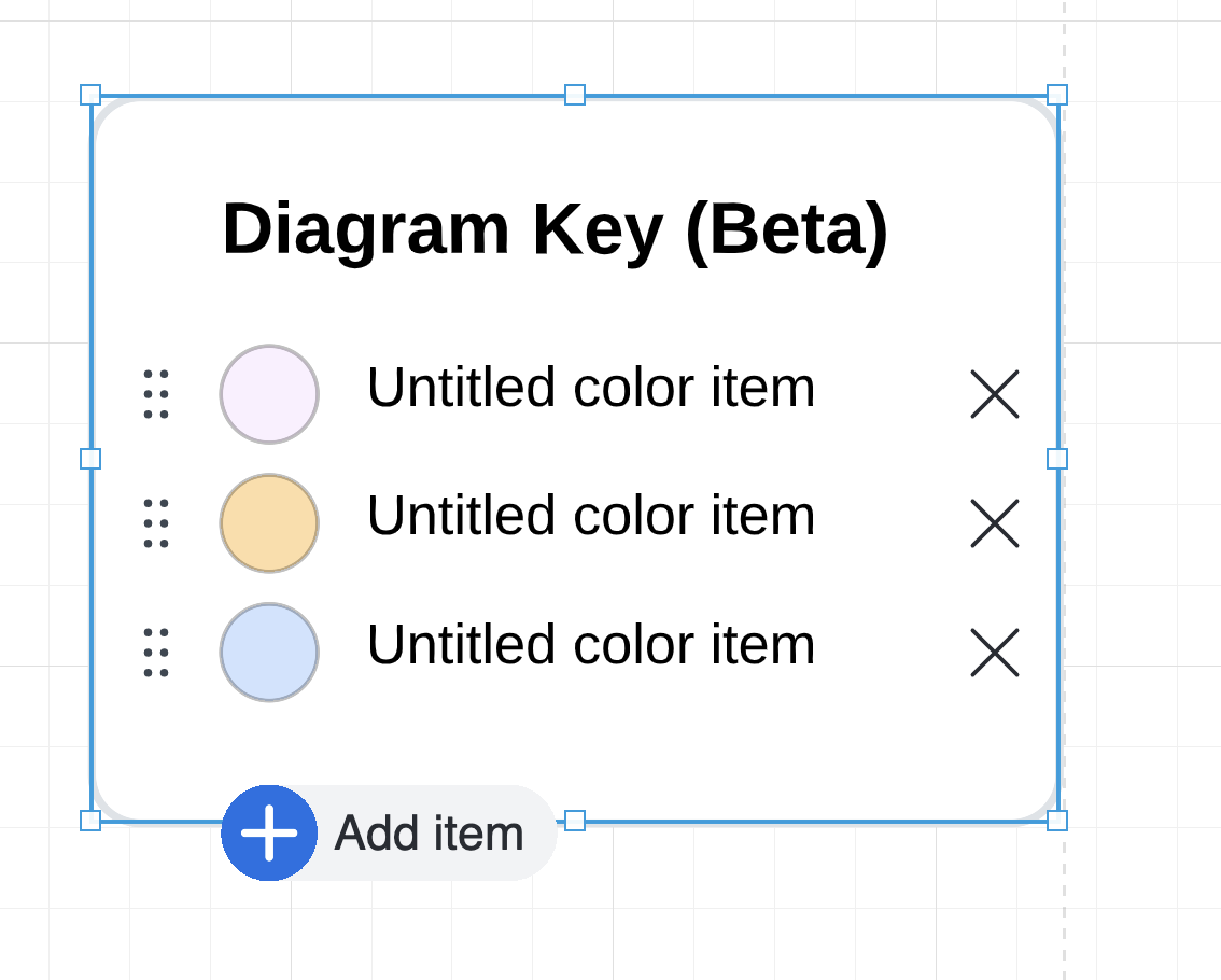
We began with the smallest useful version: a color-based legend that people could edit directly on the canvas. They could add a color, label it, reorder or remove entries, then resize and move the complete object.
Starting with color let us validate the core interaction before adding more complexity.
Holding the line on canvas-first editing
We also explored keeping the legend on the canvas while moving editing into the right panel. It was technically more feasible, but separated the object from the controls needed to use it. Internal feedback reinforced the research: it was not intuitive enough.
After a change to the engineering team, I partnered with an engineer who also believed the canvas-first direction made more sense. We worked together to make the original proposal possible. The result was harder to build, but easier to understand.

Adding shapes
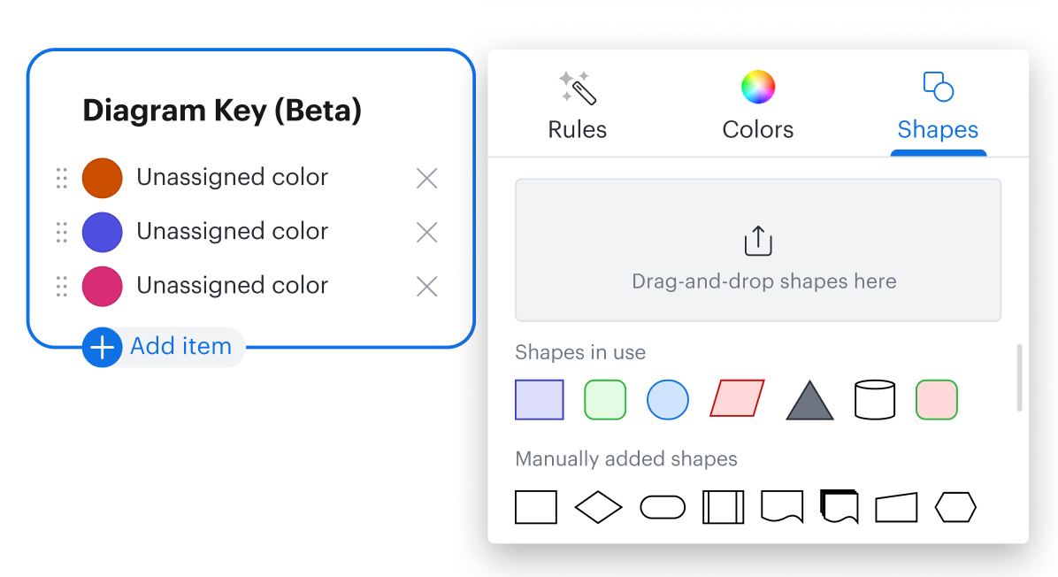
Once the color interaction was established, I extended the same Add control to support both colors and shapes. Users could choose a styled shape already present in the document or drag a new shape directly into the legend.
That made the feature more versatile, but exposed another problem: large legends still required repetitive, row-by-row work.

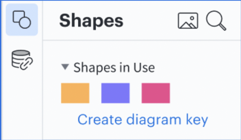
Generating a legend from Shapes in Use
Lucidchart already had a feature called Shapes in Use. It surfaced the shapes in a document and retained styling such as fill and border, giving us the exact information needed to build a shape-based legend automatically.
We added a call to action inside Shapes in Use. In one action, people could generate a useful starting point from the styled shapes already present instead of rebuilding it one row at a time.
The work contributed to a patent for automatically generating legends from graphical objects.
Two decisions inside the auto-generation
A couple of decisions inside that feature took longer than the idea itself. The first was pull-then-push. Instead of making people configure a legend up front, we pulled the styled shapes already in the document and let them push the ones they wanted into the key. The whole point was to make it easy to get started.
The second was how much should happen automatically. For a later intelligent-key concept—separate from the MVP—we tested auto-add on by default and spent time validating it before treating it as a viable direction. Blake, who I was designing this with, was a good check on me here. When one of my flows buried generation inside another menu, his reaction was basically “not another flow inside a flow inside a flow,” and he was right. In the shipped flow, we kept the call to action quiet. It only appeared inside Shapes in Use when there was useful document content to turn into a key, so it never nagged people when it had nothing to offer. A Salesforce consultant put the demand for it plainly: “if it’s smart, it would be quicker to generate something than to build it manually.”
Making a complex object resize correctly
A standard Lucidchart shape usually contained one block of text. A legend contained a heading, multiple rows, a visual value and label in each row, plus an Add control. Those elements could not all resize in the same way.
Lucidchart’s existing text-scaling behavior had not been designed for this much internal structure. The engineer and I iterated on spacing, wrapping, minimum sizes and scaling until the legend remained readable at different sizes.
It looked simple in a static mockup and became much more complicated once it had to behave on a real canvas.

Color MVP
Validate adding, labeling, reordering and removing entries directly on the object.
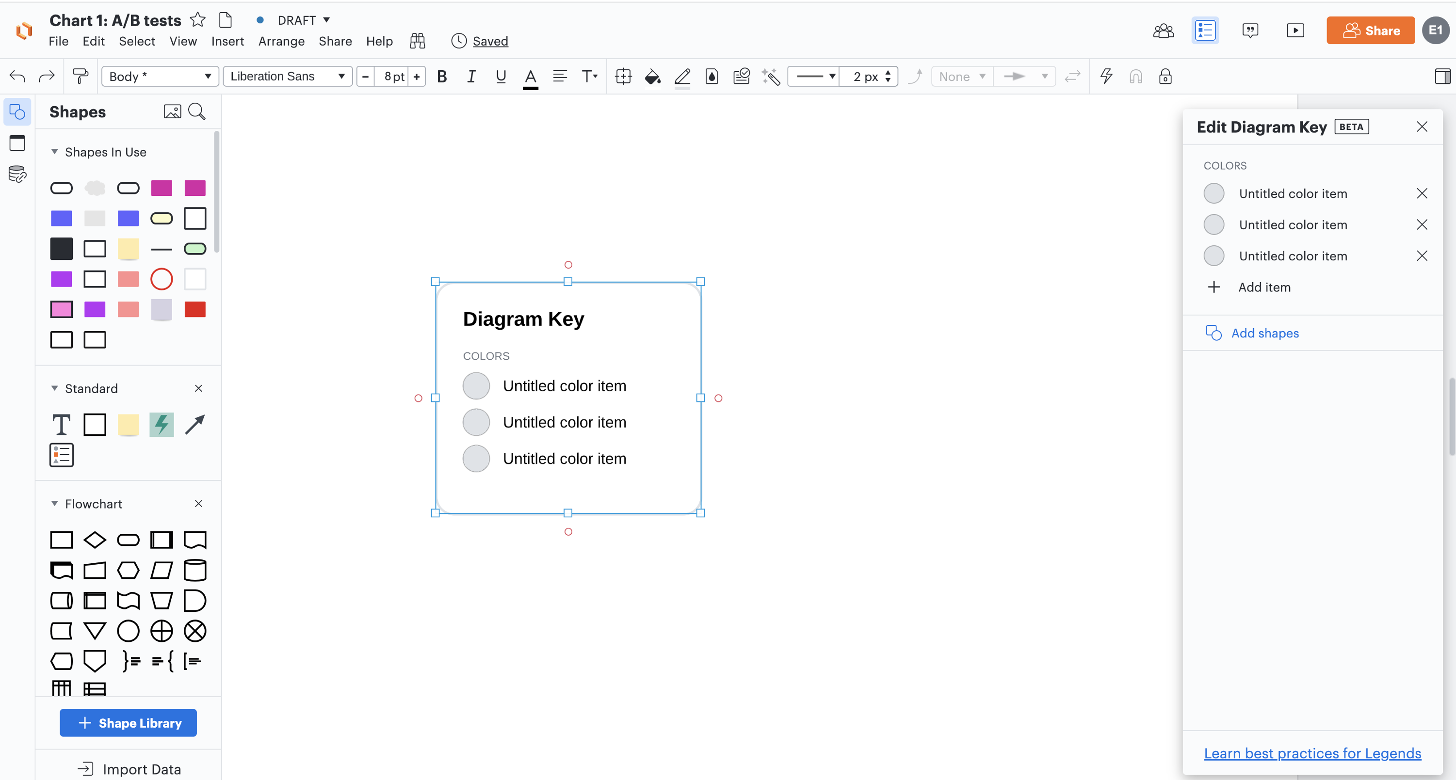
Panel exploration
Test a lower-cost implementation—and learn why separating the controls felt wrong.
Shapes
Extend the same interaction to styled shapes already present in the document.
Automatic generation
Generate a useful starting point from Shapes in Use rather than rebuilding it row by row.
The shipped interaction
A legend that behaves like a shape
People drag the legend from the Standard Shapes library, place it on the canvas and move or copy it like any other Lucidchart object.
Direct item editing
Adding, labeling, reordering and removing entries happens on the object rather than in a disconnected settings panel.
Structured resizing
The heading, labels, values and controls follow different resizing rules so the legend remains readable at multiple sizes.
Native canvas movement
The legend remains printable, exportable and easy to position beside the part of a large diagram it explains.
Helping users find the feature
We wanted the legend to feel like a fundamental diagramming tool rather than a specialized feature hidden inside a menu. We placed it in the Standard Shapes library, available in every document.
Its location communicated that:
- →A legend could be useful to any user
- →It behaved like another shape
- →People could position it anywhere on the canvas
Beta testing showed that Standard Shapes was not enough. Keys were sitting in the Standard Library on every single document and people still walked right past them. So we explored additional entry points through search, Feature Find, the Insert menu, Shapes in Use and relevant templates.
The goal was not to place the feature everywhere. We wanted it to appear where people were already likely to need it.
Standard Shapes
Search
Feature Find
Insert menu
Shapes in Use
Integrating legends with the rest of Lucidchart
There was an initial push to connect the feature with many projects under development. My PM and I looked instead for places where a legend had a natural relationship with the surrounding workflow.
Templates
Explain a real use case
Templates already contained structured content. A legend could explain their visual conventions while introducing the feature in context. We mapped a rollout across 93 English templates.
Conditional Formatting
One integration, not the definition
I explored generating a legend while someone created formatting rules. The connection made sense, but it was one way to use a legend rather than the reason every legend existed.
How far should a legend reach into Conditional Formatting?
Conditional Formatting was the hardest integration to scope, and it is where the consumption-versus-creation principle earned its keep. The tempting version let you edit a formatting rule straight from the legend. We mocked three levels of it: build full editing menus for every item right on the shape, build a few for the common cases, or just open the existing Conditional Formatting panel when someone wanted to make a change.
The deeper we went, the more we were rebuilding the rules engine inside a shape, and keeping the legend and the rules in sync both ways turned out to be much harder than one way. Research kept pointing the same direction too. A lot of people did not even know Conditional Formatting existed, so loading the legend up with rule-editing was not solving their real problem. So we let the legend explain the rules and sent people to the real panel to change them. The legend was there to help you understand the diagram, not to run it.
Concepts we explored but did not ship
These ideas reveal the broader system we considered, while keeping a clear boundary between concepts and the work that reached production.
Line-based legends
Based on the card sort, line styles were the next logical extension after shapes. I designed a Lines in Use concept, but Lucidchart had no equivalent line-rendering foundation and the engineering scope was too high.
Conditional Formatting legends
I designed legends generated directly from formatting rules. The concept returned to the original opportunity, but required deeper integration with the rules system than we could support.
Dynamic legends
We explored updating a legend automatically as new colors and shapes appeared. People liked the convenience but wanted a clear way to pause or limit updates before the legend became cumbersome.
Pinned legends
A pinned legend could remain visible while someone zoomed or panned across a large canvas. The necessary canvas changes made the idea too technically expensive for the project.
Interactive presentation legends
Selecting an item highlighted the matching objects on the canvas. People liked it, and in testing several reached for it on their own, clicking a key item or right-clicking and expecting to link it to a shape. But exact color matching was unreliable, two colors could look identical while using different hex values, and the broader scope was high. It also reinforced that this should stay optional. The legend’s primary job was explanation, not running the canvas.
Launch and impact
Diagram Keys launched in 2021. The available weekly dataset begins in May 2022 and records broad, actively promoted usage beginning in late September 2022.
Across 148 weeks with recorded activity through May 2025, the feature averaged approximately 159,000 weekly events from 12,900 distinct users. Weekly events peaked at 237,696, while weekly users reached a separate peak of 17,573.

We actively promoted the feature around launch, but usage remained consistent long after that initial push. To me, that sustained behavior is a stronger signal than the launch spike: the feature continued to solve a real need after people discovered it.
What the aggregate metrics did not explain
Sustained usage told us the feature mattered, but it did not explain a recurring behavior: people renamed items far more often than they changed their visual values. We wondered whether prefilled template legends were causing the gap.
A post-launch document audit did not support that hypothesis. The rename-to-change ratio was essentially the same in template and blank documents. That changed the next step from “fix the templates” to improving the text hit area, tightening event tracking and returning to qualitative research to understand the behavior.

A foundation for future canvas features
The impact extended beyond Diagram Keys. Its interaction model and technical framework became a foundation for Shape Banks, Custom Shape Banks, Sticky Note Banks, T-shirt Sizing and Estimates.

What I took away from the project
This project started with a behavior users had already created for themselves. They wanted their diagrams to communicate clearly and were doing a lot of manual work to make that possible.
Research helped us separate the underlying need from the solutions people initially requested. That distinction shaped the most important decisions we made:
- →Prioritizing colors and shapes
- →Keeping interactions directly on the canvas
- →Treating the legend as a consumption tool
- →Generating it from content already in the document
- →Integrating it only where the surrounding workflow made sense
Not every idea reached production. The core experience did, and people continued using it years after launch.
If I did this again, I would set those principles earlier. We landed on “a key is for reading a document, not changing it” partway through, almost as a north star after the fact, and a lot of the back-and-forth in the first few months would have been shorter if we had written it down on day one.
I began the project thinking I was designing one new shape. By the end, we had created a new kind of canvas object and a framework Lucid could apply to several other features. That broader foundation is the outcome I value most.